Case study · 2026
Lumen
A lab report PDF becomes a dashboard you can read in ten seconds — parsed, scored, charted and interpreted, with a designed PDF back out.
- Next.js 16
- React 19
- TypeScript
- Tailwind v4
- FastAPI
- pdfplumber
- jsPDF
- LLM
The problem
A lab report is a wall of numbers. Forty biomarkers, each with a value and a reference range, and no indication of which three actually matter. Reading one properly takes a clinician a few minutes and a patient considerably longer, if they manage it at all.
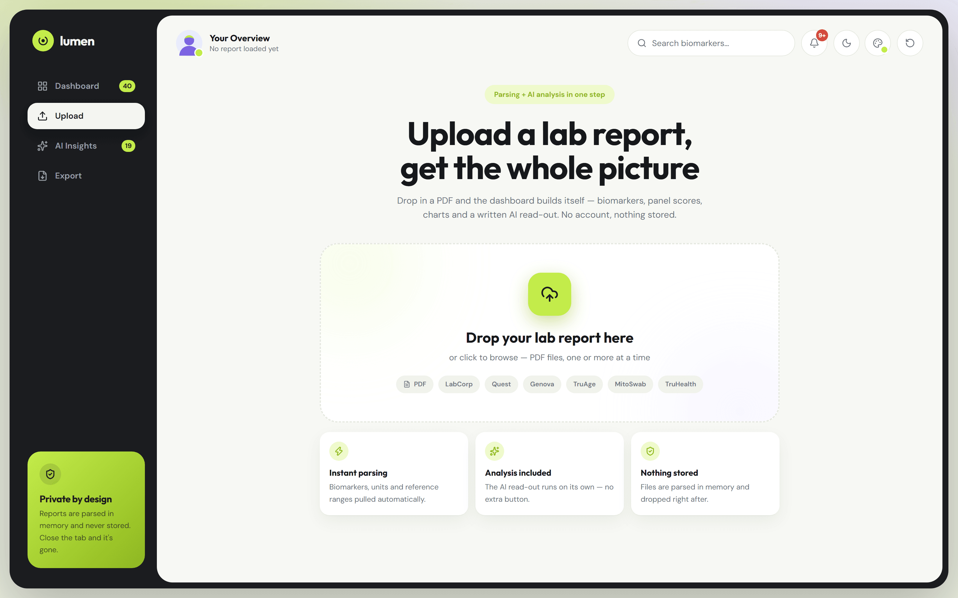
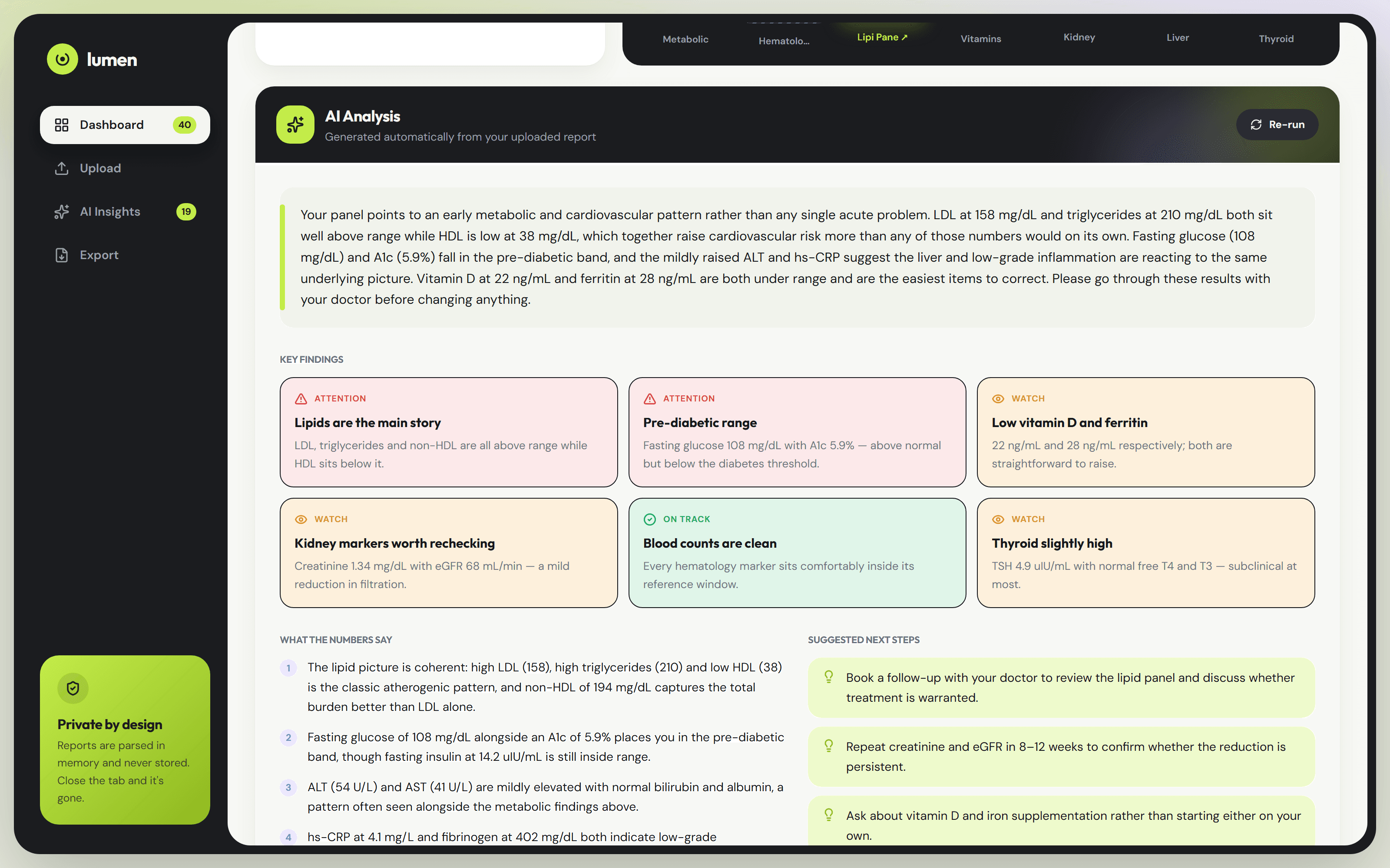
Lumen takes the PDF and gives back a dashboard. Parsing, scoring and charting happen in a single pass, and the AI read-out writes itself the moment parsing finishes — there is no Analyze button to press.
What it does
- Drop in one PDF or several. No account, no sign-up, no intake form.
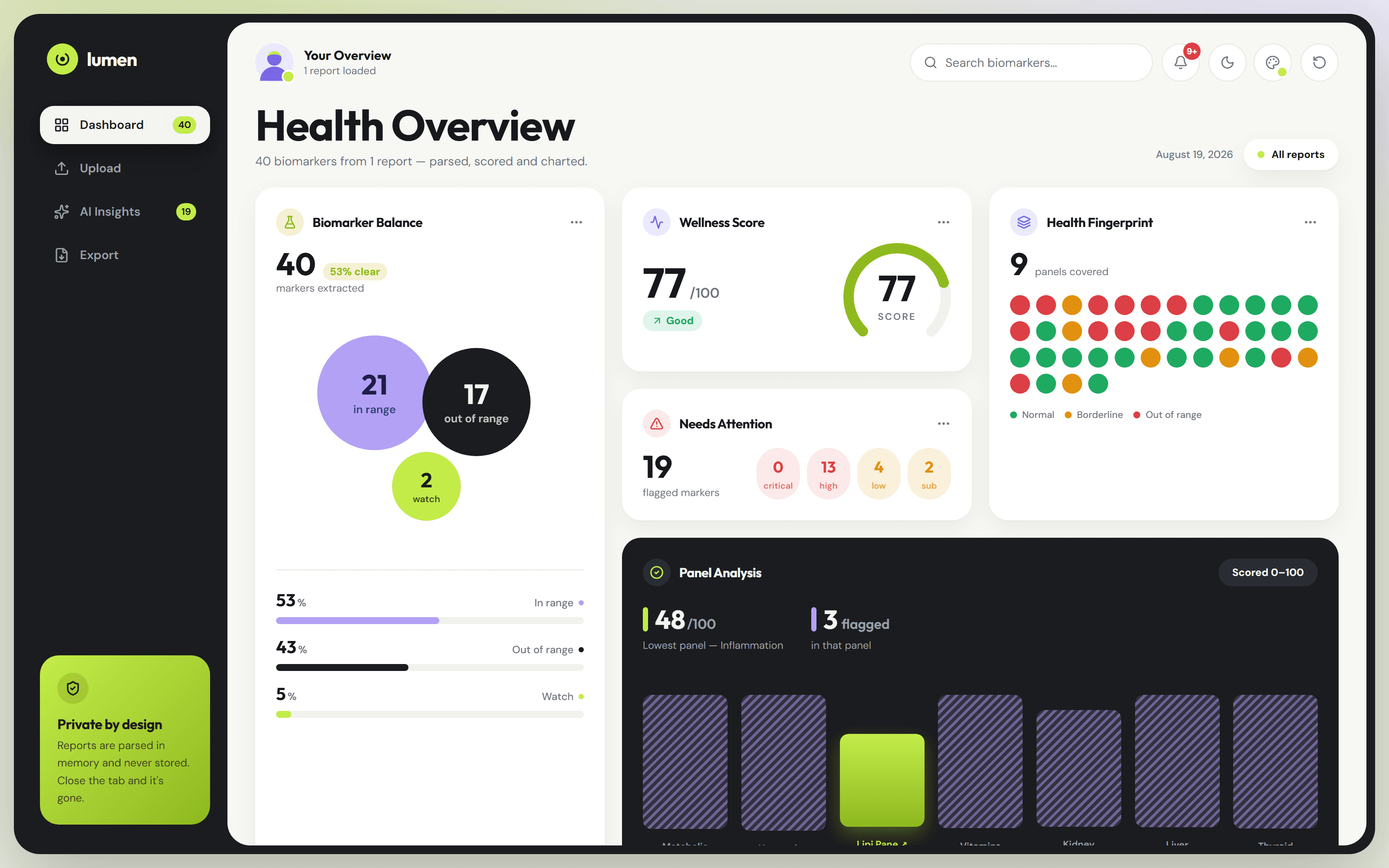
- Bubble sizes are proportional to how many markers landed in each state, and the fingerprint grid puts one dot per biomarker so an unhealthy panel is visible before you read a word.
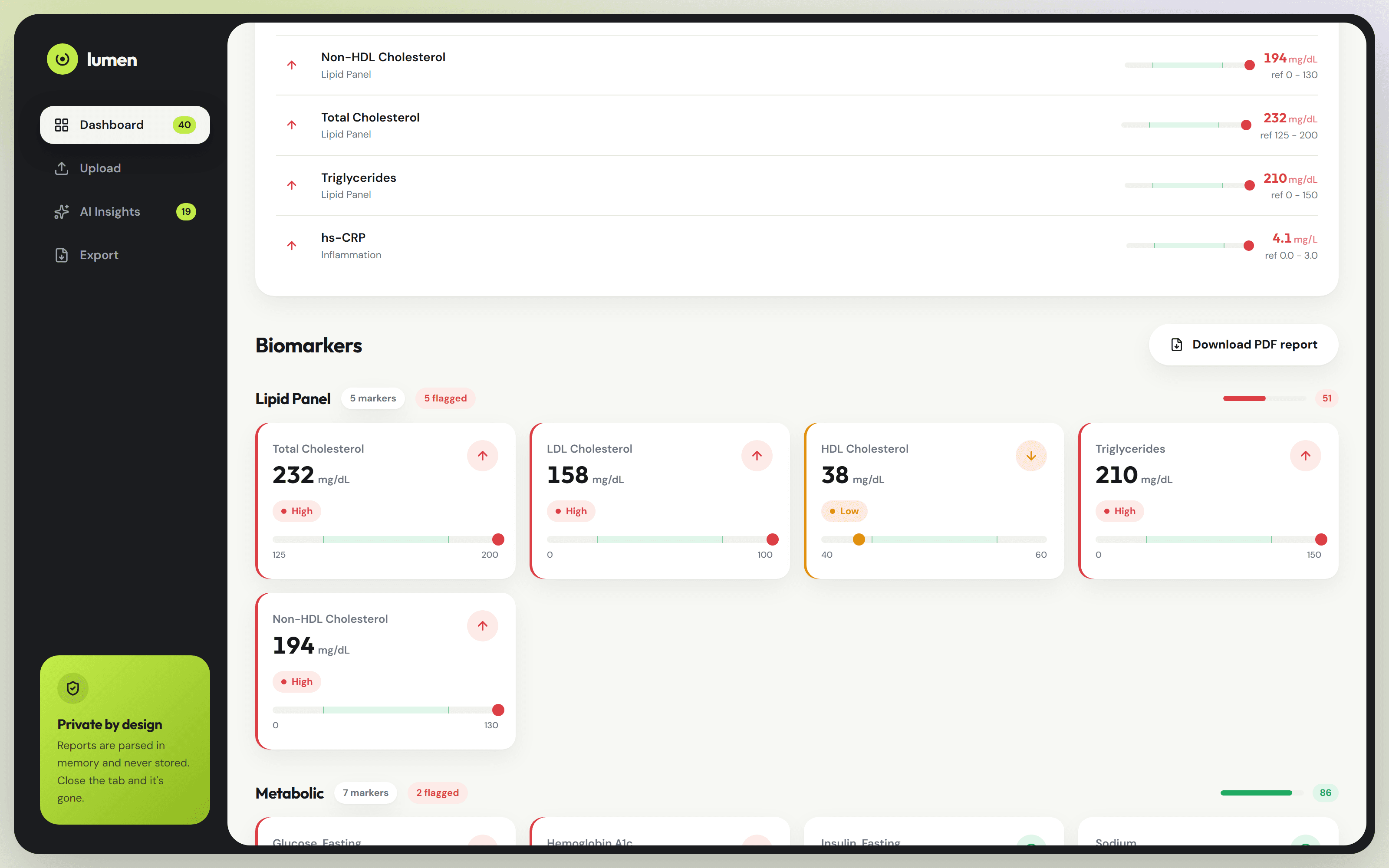
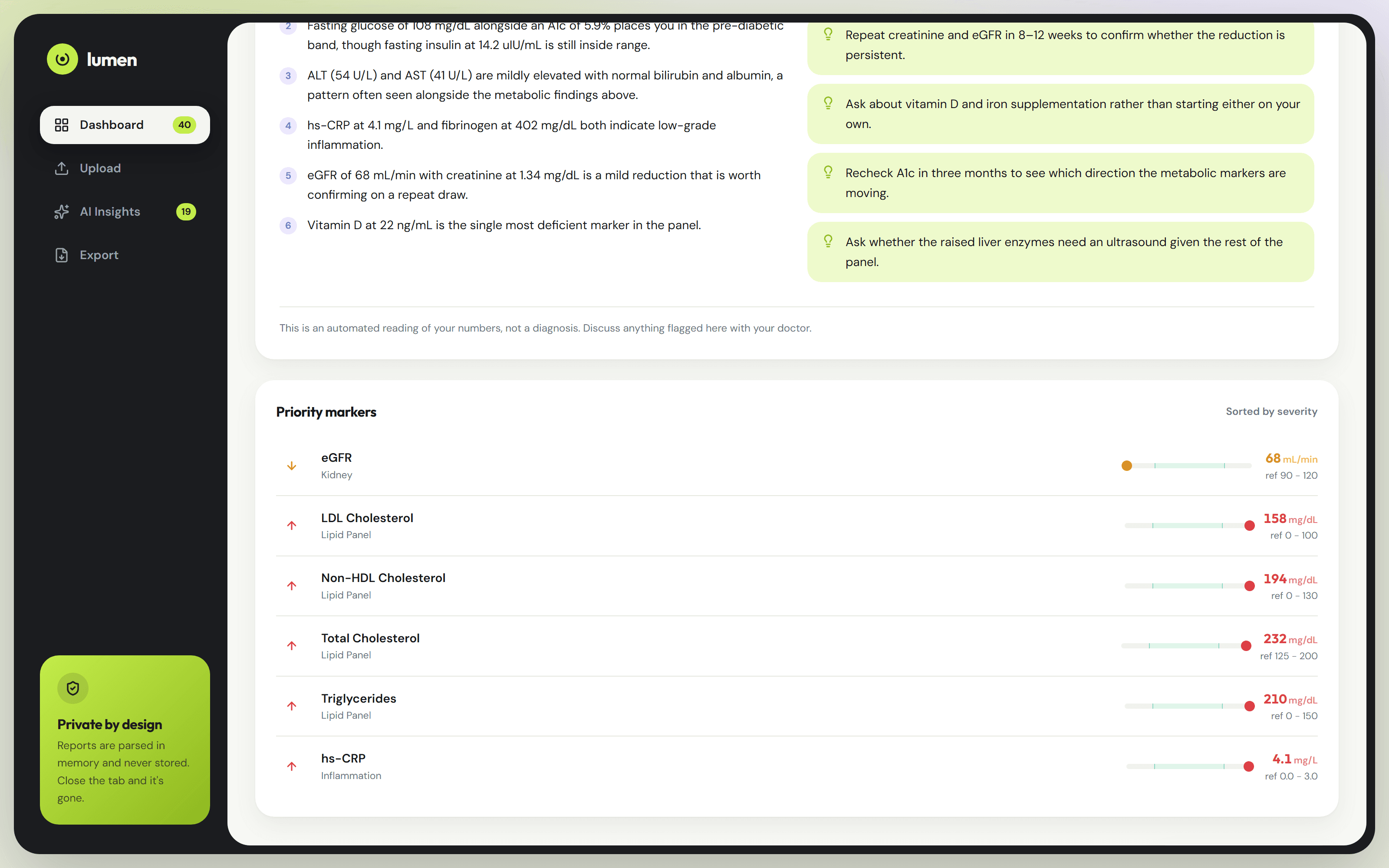
- Every marker is plotted on its own reference-range track, so 158 reads as how far out of range it is, not merely that it is.
- Priority markers are ranked by severity first, then by actual distance from the reference band — a genuine triage rather than whatever panel parsed first.
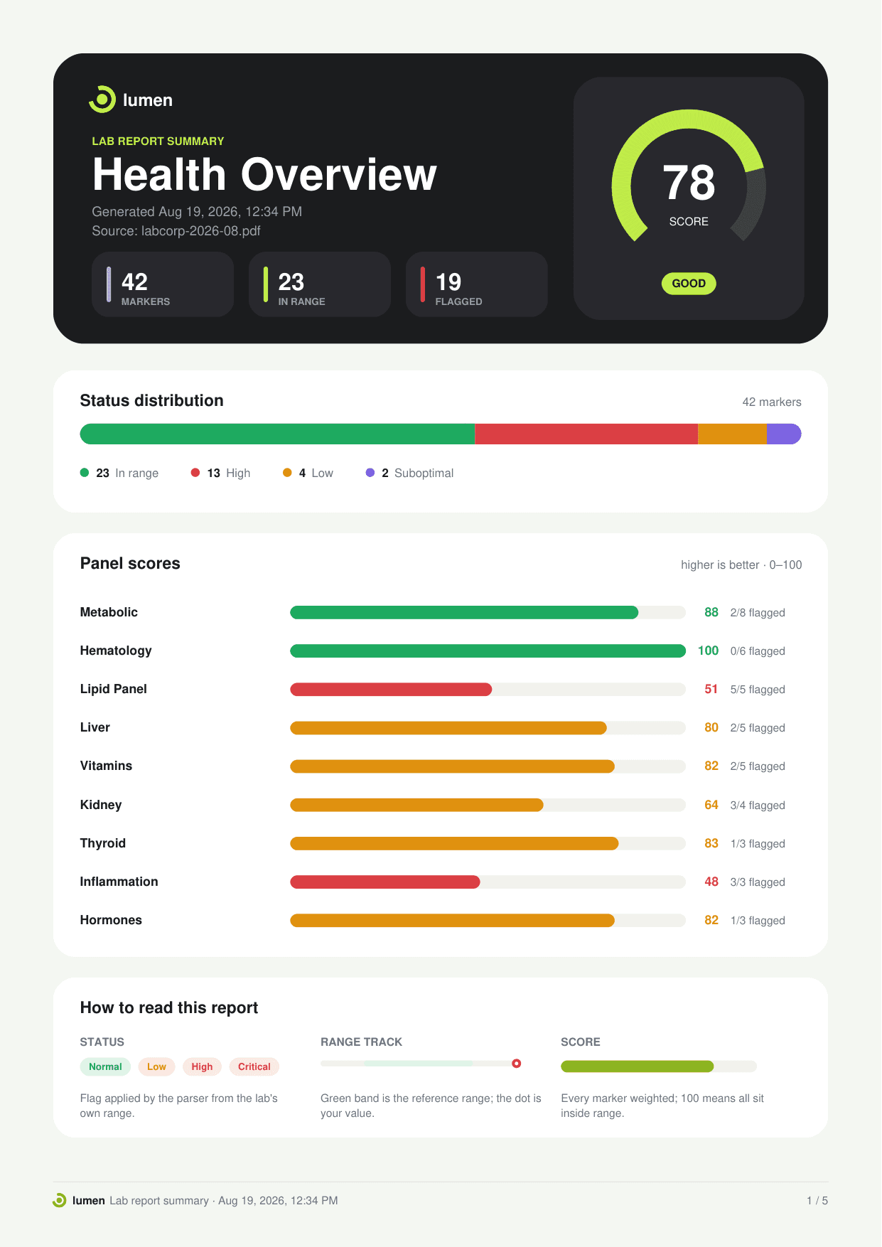
- The PDF export draws the score dial, distribution bar, panel chart and every range plot as real vector shapes, so text stays selectable and nothing blurs at any zoom.
- Reports are parsed in memory and never stored. Close the tab and it is gone.
What was hard
Lab PDFs have no schema
Every laboratory lays its report out differently, and a marker's name, value, unit and range can sit in four unrelated places on the page. The parser works from geometry rather than text order, which is the only thing that generalises across labs.
A score has to be defensible
Panel scores run 0–100, and the number is only useful if it moves for a reason. Scoring works off distance from the reference band, weighted by severity, so a marker sitting just outside a range never reads the same as one sitting far outside it.
Vector PDF, not a screenshot
Exporting the dashboard as an image would have taken an afternoon. Redrawing the dial, distribution bar, panel chart and every range plot as jsPDF vector primitives took considerably longer, and it is the reason the report survives being printed.
Other case studies
(2)Precision Health Platform
A clinical genomics platform built from an empty repository to production — a million classified variants, ACMG classification, polygenic risk scores, and a physician-configurable AI layer on top.
GoldFeed
A Persian-language gold market terminal — live fund pricing, eleven technical indicators voting on one mechanical rating, news impact, and an analyst that draws on the chart.